Axiom – SaaS Dashboard Design
Axiom – SaaS Dashboard Design
Axiom – SaaS Dashboard Design
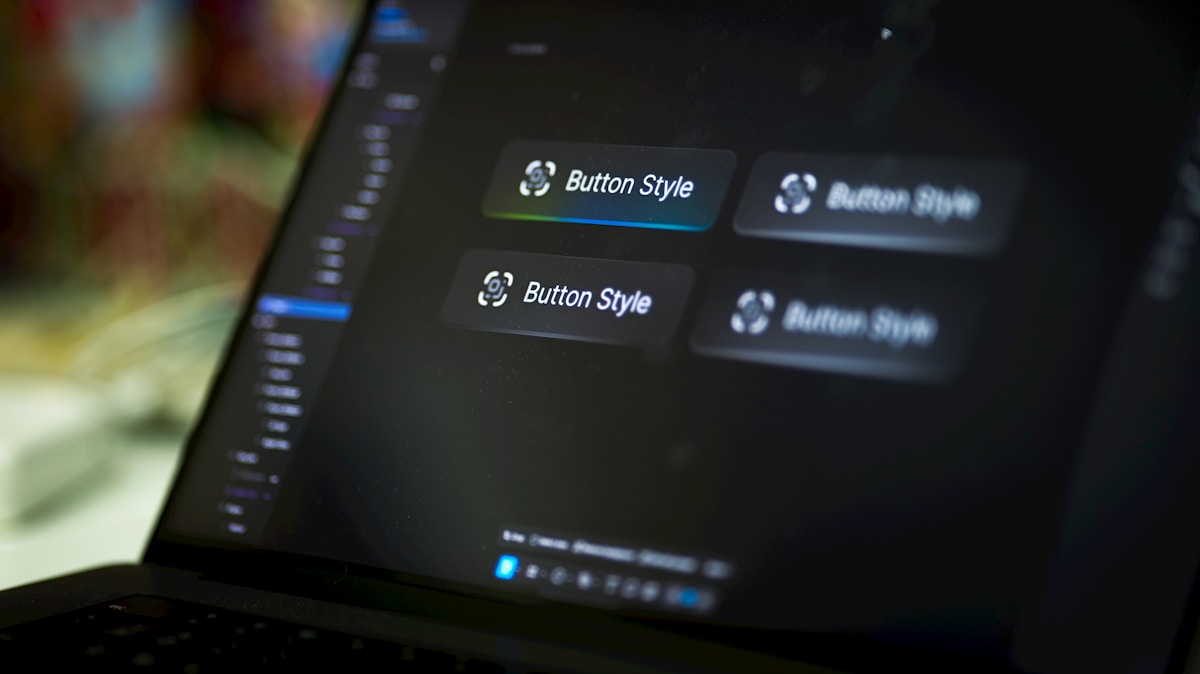
Product design for Axiom's core analytics dashboard — making powerful data tools approachable without sacrificing depth.
Product design for Axiom's core analytics dashboard — making powerful data tools approachable without sacrificing depth.
Product design for Axiom's core analytics dashboard — making powerful data tools approachable without sacrificing depth.
Category
Category
Category
SaaS / Product
SaaS / Product
SaaS / Product
Services
Services
Services
Product Design, Design System, UX Strategy
Product Design, Design System, UX Strategy
Product Design, Design System, UX Strategy
Client
Client
Client
Axiom Analytics
Axiom Analytics
Axiom Analytics
Year
Year
Year
Enterprise software has long been the domain of utility over beauty — dense interfaces, steep learning curves, and visual languages that prioritize information density at the expense of usability. Axiom came to us with a different philosophy: they believed their analytics platform could be both powerful and pleasurable to use, and they needed a design partner who shared that conviction.
The project kicked off with an intensive audit of the existing product — a codebase-generated UI that had evolved organically over three years without a coherent design system. We mapped over 600 unique interface elements, identified 23 distinct interaction patterns, and catalogued 47 inconsistencies in spacing, typography, and color alone.
From this audit, we developed a Design Principles document that would guide every subsequent decision: Clarity over cleverness, Progressive disclosure, Consistency through constraint, and Delight in the details. These principles became the north star for the entire redesign.
The new design system — named Axiom Design System (ADS) — comprises a token-based color palette with full dark and light mode support, a 12-column responsive grid, a complete typography scale with five size levels and three weight variations, and a component library of 280+ elements.
The dashboard itself was redesigned around three core user jobs: monitoring, investigating, and reporting. Each job has its own visual rhythm and information density. The monitoring view is sparse and high-contrast, built for glanceability. The investigation view supports deep data exploration with side-by-side comparisons and linked drill-downs. The reporting view exports-ready with one-click PDF and shareable link generation.
Motion design played a crucial role in communicating state changes. We defined 14 animation presets that handle loading states, data updates, error conditions, and empty states — all orchestrated to feel responsive without distracting.
Pilot testing with 30 enterprise users showed a 52% reduction in time-to-insight for new users compared to the legacy interface, and a 4.6/5 satisfaction score in post-session surveys.
Enterprise software has long been the domain of utility over beauty — dense interfaces, steep learning curves, and visual languages that prioritize information density at the expense of usability. Axiom came to us with a different philosophy: they believed their analytics platform could be both powerful and pleasurable to use, and they needed a design partner who shared that conviction.
The project kicked off with an intensive audit of the existing product — a codebase-generated UI that had evolved organically over three years without a coherent design system. We mapped over 600 unique interface elements, identified 23 distinct interaction patterns, and catalogued 47 inconsistencies in spacing, typography, and color alone.
From this audit, we developed a Design Principles document that would guide every subsequent decision: Clarity over cleverness, Progressive disclosure, Consistency through constraint, and Delight in the details. These principles became the north star for the entire redesign.
The new design system — named Axiom Design System (ADS) — comprises a token-based color palette with full dark and light mode support, a 12-column responsive grid, a complete typography scale with five size levels and three weight variations, and a component library of 280+ elements.
The dashboard itself was redesigned around three core user jobs: monitoring, investigating, and reporting. Each job has its own visual rhythm and information density. The monitoring view is sparse and high-contrast, built for glanceability. The investigation view supports deep data exploration with side-by-side comparisons and linked drill-downs. The reporting view exports-ready with one-click PDF and shareable link generation.
Motion design played a crucial role in communicating state changes. We defined 14 animation presets that handle loading states, data updates, error conditions, and empty states — all orchestrated to feel responsive without distracting.
Pilot testing with 30 enterprise users showed a 52% reduction in time-to-insight for new users compared to the legacy interface, and a 4.6/5 satisfaction score in post-session surveys.
Enterprise software has long been the domain of utility over beauty — dense interfaces, steep learning curves, and visual languages that prioritize information density at the expense of usability. Axiom came to us with a different philosophy: they believed their analytics platform could be both powerful and pleasurable to use, and they needed a design partner who shared that conviction.
The project kicked off with an intensive audit of the existing product — a codebase-generated UI that had evolved organically over three years without a coherent design system. We mapped over 600 unique interface elements, identified 23 distinct interaction patterns, and catalogued 47 inconsistencies in spacing, typography, and color alone.
From this audit, we developed a Design Principles document that would guide every subsequent decision: Clarity over cleverness, Progressive disclosure, Consistency through constraint, and Delight in the details. These principles became the north star for the entire redesign.
The new design system — named Axiom Design System (ADS) — comprises a token-based color palette with full dark and light mode support, a 12-column responsive grid, a complete typography scale with five size levels and three weight variations, and a component library of 280+ elements.
The dashboard itself was redesigned around three core user jobs: monitoring, investigating, and reporting. Each job has its own visual rhythm and information density. The monitoring view is sparse and high-contrast, built for glanceability. The investigation view supports deep data exploration with side-by-side comparisons and linked drill-downs. The reporting view exports-ready with one-click PDF and shareable link generation.
Motion design played a crucial role in communicating state changes. We defined 14 animation presets that handle loading states, data updates, error conditions, and empty states — all orchestrated to feel responsive without distracting.
Pilot testing with 30 enterprise users showed a 52% reduction in time-to-insight for new users compared to the legacy interface, and a 4.6/5 satisfaction score in post-session surveys.

